

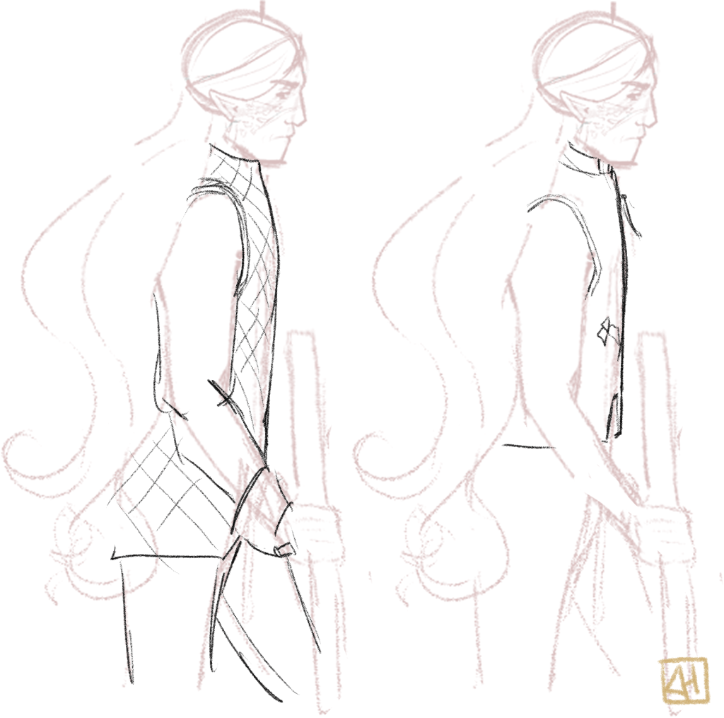
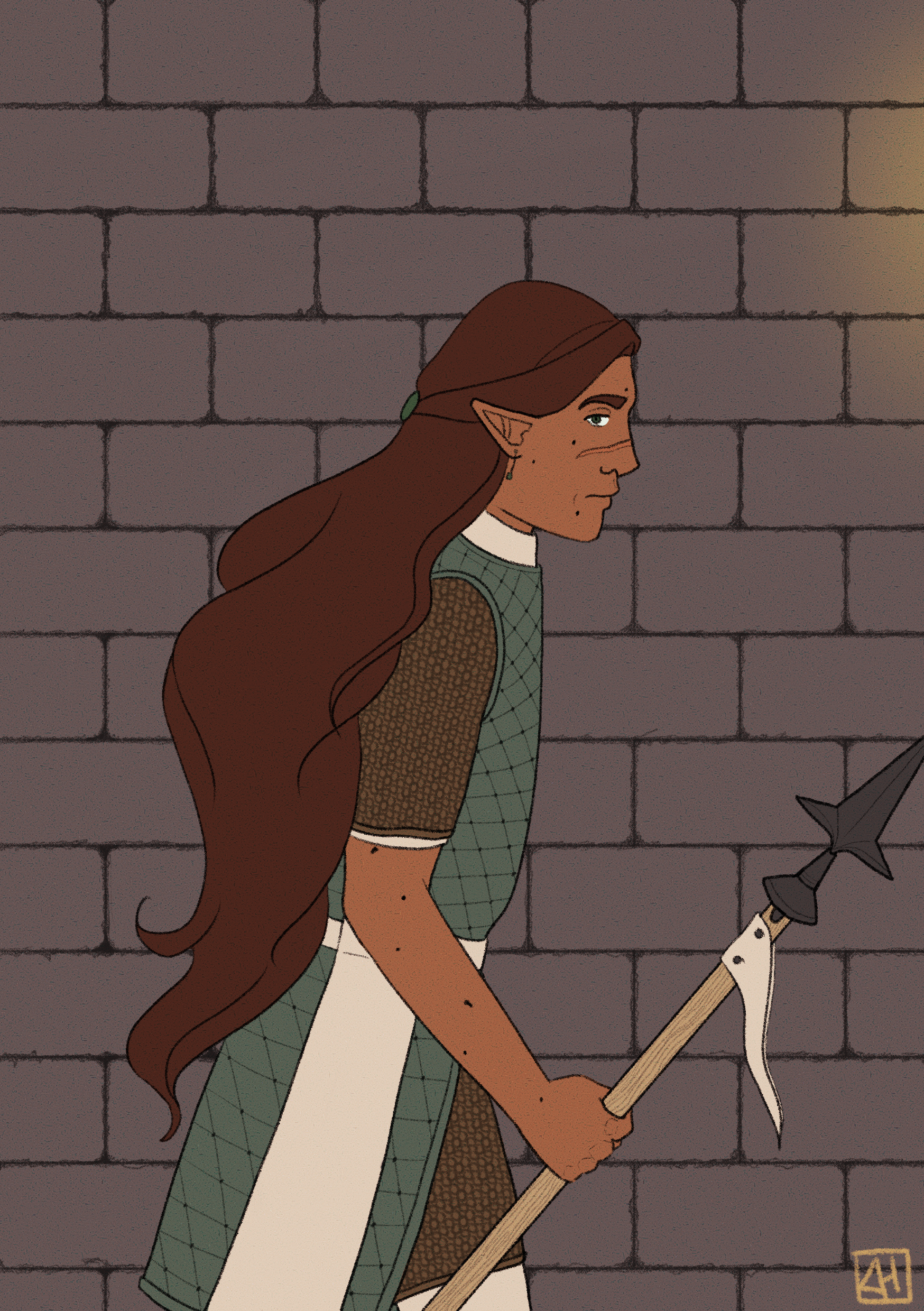
My rough sketch shows a half-elf with long flowy hair in a side view. Considering the scene is inside and he is supposed to be wandering the setting as a guard I wanted him to wear lighter armor that would be able to take blunt hits that gives him enough endurance to move about for a long time.
Because of this I chose to dress the character in a combination of gambeson and maille. To get some inspiration I looked around at historical artwork, mostly looking at the sillhouettes of the clothes.
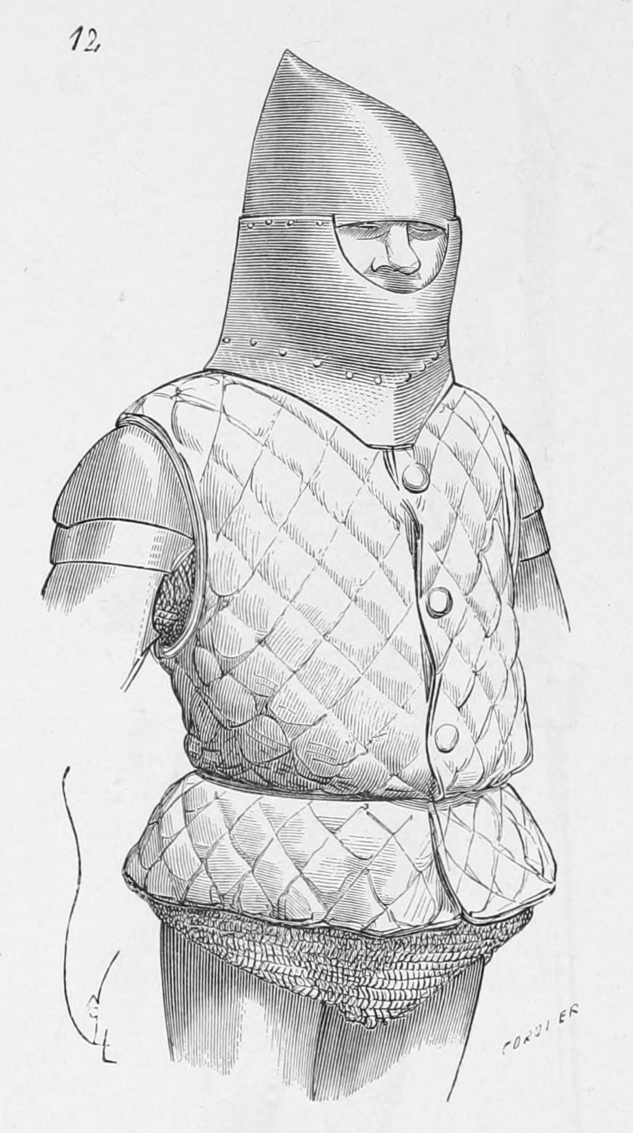


I really liked the look of the gambesons shown in the Morgan Bible paintings, but without the full length sleeves that were depicted (Since I’m not going for full historical accuracy I feel it is okay if I deviate from and mix elements of my sources of inspiration).
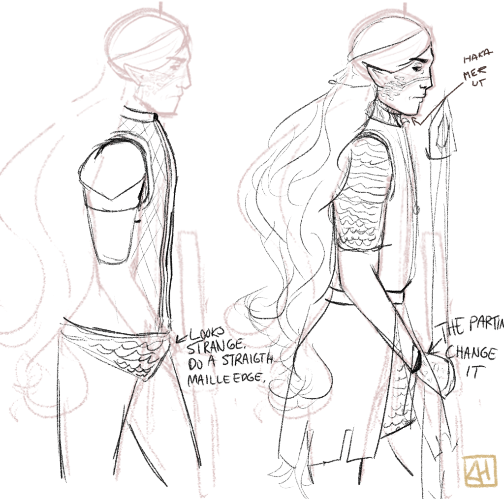
Out of the sketches I made, I enjoyed the last one the most, due to the more visible mix of patterns it would create with both the maille and gambeson visible. Additionally, I thought the longer gambeson on top of shorter (but still visible) maille would create nice opportunities for more shading a more interesting lower part of the illustration.
The last thing I did before I jumped into line art was to read a bit more about different types of polearms, as I wasn’t sure what type I wanted to use. I then made a simple graphic for my own future reference to quickly be able to differentiate different types of polearms, as descriped in the book “Vapen” by the Diagram Group from1986 (It’s a Swedish translation).

I decided to use a partisan as I wanted something pointy and I thought the shape could blend in very well with the quadrilateral shapes other inanimate objects had (Since the main body of the partisan could be designed to look like an irregular rectangle with two points sticking out of it)
The line art was made with brush mimicking a pencil for some texture and opacity variations through the piece. I used to ink with an opaque untextured brush in the past, but have found that a textured brush creates more interesting lines.
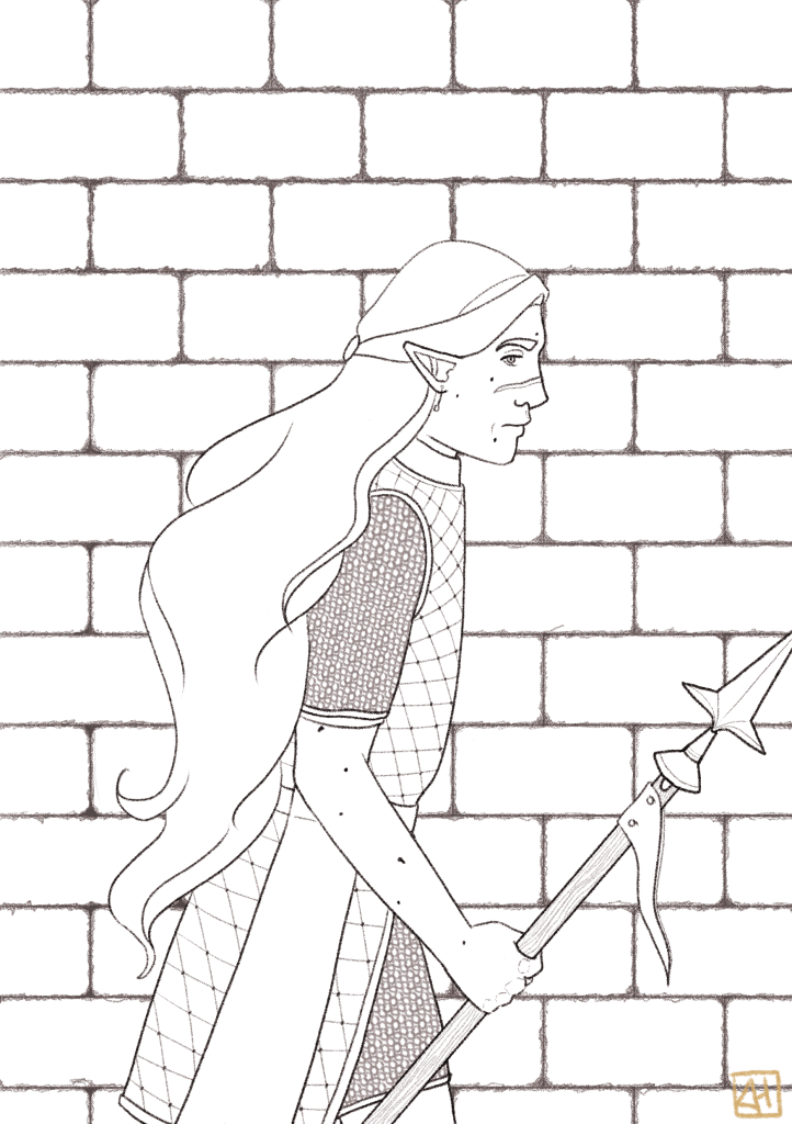
The colors I used a limited palette of reds, oranges and greens with a few yellow details. To create some visual hiearchy and draw attention to the most important locations of the illustration I made the character’s skin and hair the most saturated, while the background was almost entirely desaturated (And the character’s clothing being a middle point).
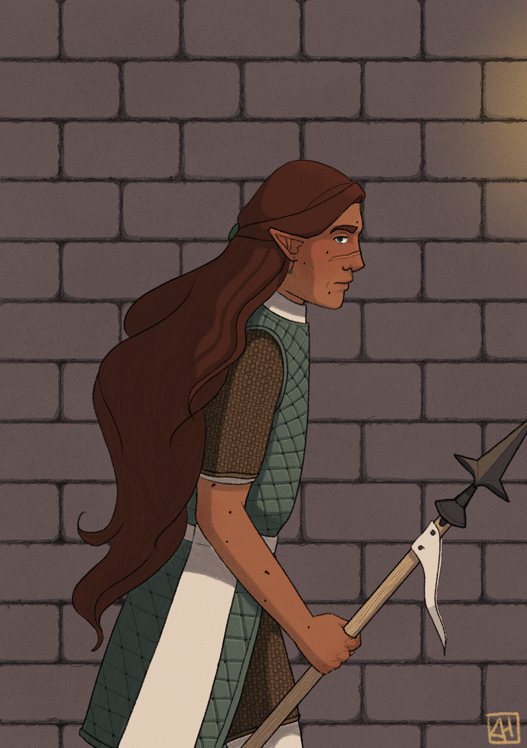
Below is a comparison between the flat coloring and the finished piece. Thanks for reading!

Leave a comment