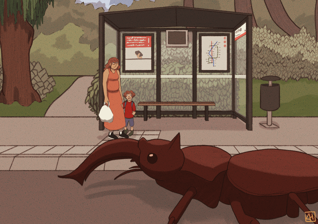
I had a lot of troubles finishing this piece for some reason. I had the concept nailed down, but each part of the process came with challenges that I didn’t expect. I’ll discuss these as I show the process of this illustration. What you’ll notice is that I cropped the final illustration, because I thought the original composition was a bit too empty.
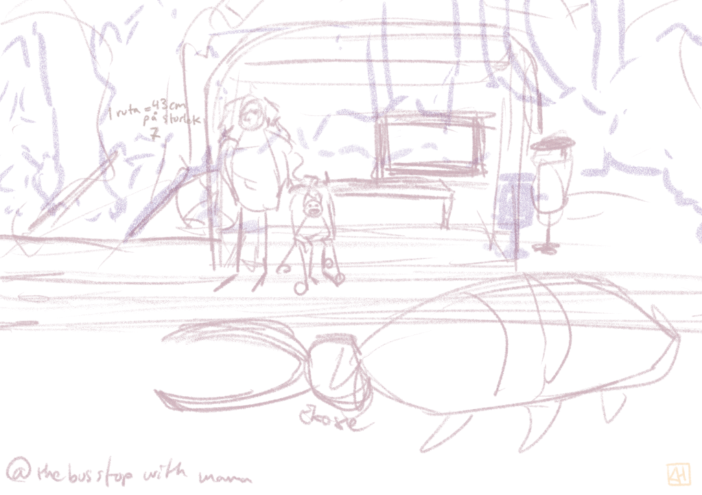
Initially there were very few issues, mostly because I tend to sketch quite roughly if the illustration doesn’t involve detailed characters. While I’m not the kind of artist to struggle with line art, I have a tendency to leave a bit too much ambiguity in the sketching stage, which means I usually have to make a lot of creative choices later.
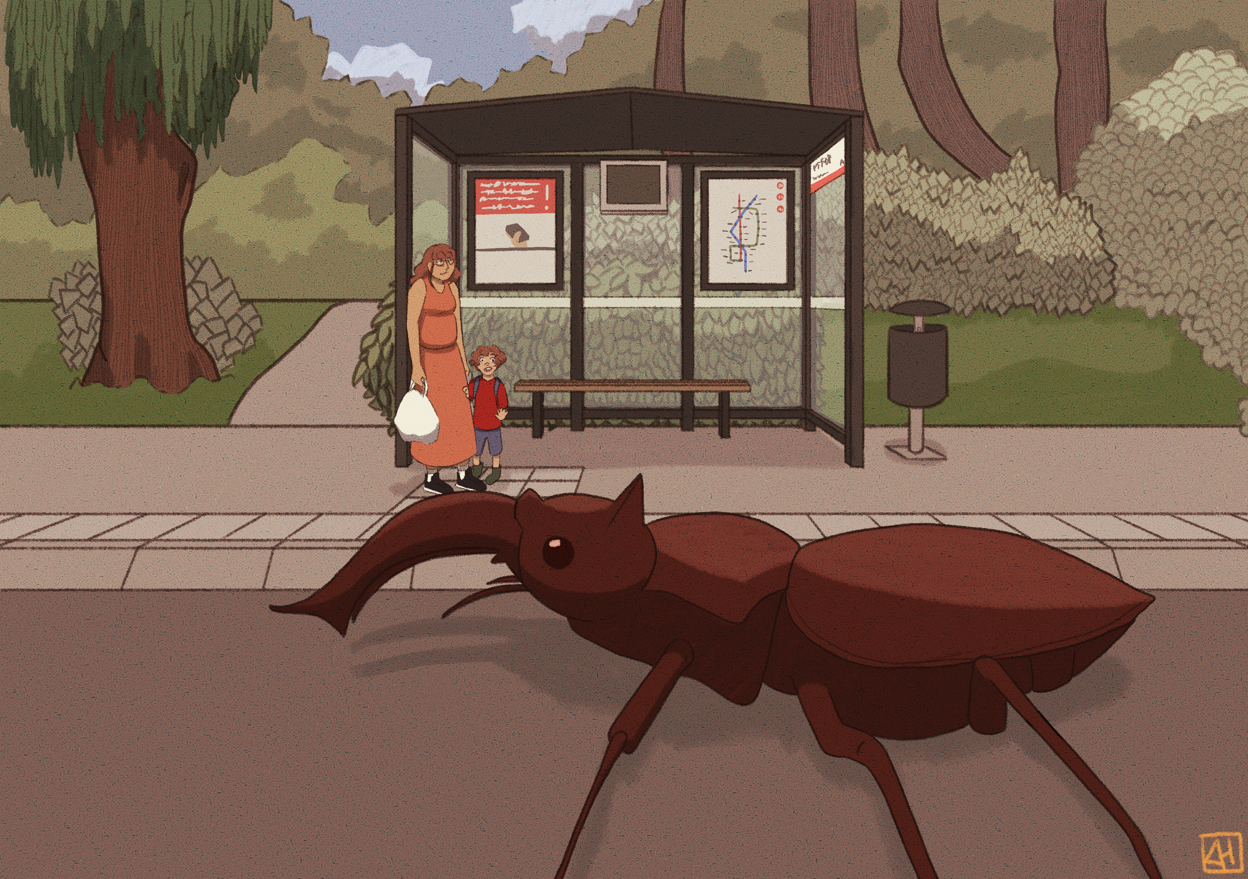
In retrospect, I probably should have done a few studies and thumbnails before deciding on the final composition, especially considering the fact that I didn’t have any clue how to draw trees or insects, let alone rhino beetles.
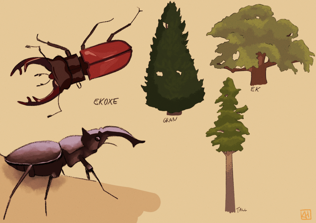
Instead, did my studies after the sketch was already done. The bottom rhino beetle was used as a sketch in the actual illustration later on, as the study nailed the position I wanted it to be in.
When I make illustrations that contain any type of structure, I use the perspective rulers in Clip Studio Paint. They are useful to keep the perspective straight and coherent, but above all it has a grid setting that makes sure I can calculate distances in perspective without the headache of using diagonals and additional vanishing points. I definitely still have a lot to learn when it comes to perspective, but my process gets faster and more efficient the more I use it.
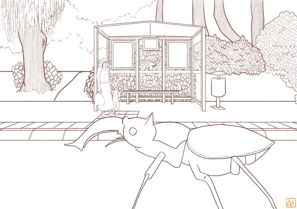
During the line art stage I definitely ran into a lot of troubles. First of all, balancing the level of detail in nature is something I struggle with a lot. I find buildings and interiors to be far easier than nature itself, as the cut off for detailing is more straight forward. I often find myself pondering how to depict trees and nature in a illustrative but detailed way during my walks in nature, but thus far I haven’t found a good middle ground. I’ll just have to keep making studies and practicing.
Secondly, a lot of doubt started too creep up on me when it came to illustrating the far back, since I tend to feel like I should fill every space of an illustration with detail. I knew logically that doing so would make the image too crowded, but yet again it’s one of those things I need to improve on.
Moving onto color, I used a lot of greens for the background, and tried to limit the reds to the characters themselves to pull more attention towards them. Apart from a few hiccups here and there, my biggest strife with coloring and finishing the piece was reaching the point where I actually felt like it was done. But in the end I’m quite happy with the result, and even more so with the lessons that the process of this piece has taught me.
Thanks for reading, and until next time!


Leave a comment