
I have asked myself this question while coloring the current project I have been working on. In this post I’m going to recount the issues I found in my own artwork and discuss things I’m planning to do to improve on those points. I hope you’ll be able to learn something too! The pigeon illustration is just a fun silly little thing I did.
Perception vs. skill
As many artists might relate to, there is at times a gap between our abilities to see and our skill. When my ability to see and critique my own work surpasses my technical skills I tend to fall into a slump where I find my art unappealing.
While this can be incredibly frustrating since my work don’t turn out how I want it to, I try to use those periods in a constructive way (If I don’t I start feeling blocked creatively and self concious). I’m fairly certain that I’m in this type of period currently, which is why I decided to make this instead of continuing to work on an illustration that makes me frustrated because it doesn’t look right.
Separating foreground and background
I love making detailed backgrounds, yet they seem flat, even when I add rendering that doesn’t fit the style of art I make. Yesterday, I realised that me neglecting to separate foreground, middleground and background in my work definitely makes this worse. To give an example of what I mean, I’ll show the artwork that caused my current frustration.
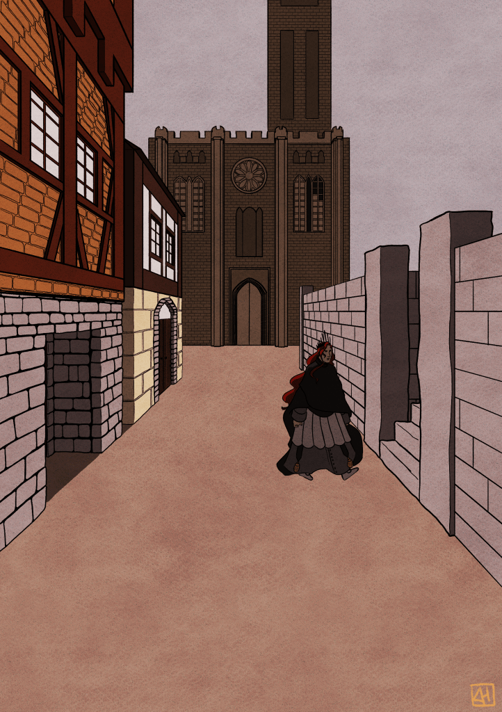
Yes, I definitely can make this look less flat and ‘off’ if I had continued to work on the piece, yet there is a few issues with this piece and how it was planned that makes any work to fix this illustration frustrating and futile (It won’t remove the underlying wrongs). Notice the church in the background? It’s one of the biggest problems.
Why is the church in the far back orders of magnitude more detailed than the wall in the foreground? I wouldn’t be able to give you an answer to this question, and I’m the one that started working on this piece. Not only does that show poor planning (Which I definitely am guilty of for this one) but also a need for more separated foregrounds middlegrounds and backgrounds to make it easier for me to distinguish the level of detail more clearly. With this piece I put a lot of effort into the church and thus using a lot of energy that should have been used to populate the foreground with more detail. Instead, it looks empty.
I think I need to do more studies on detailing objects with lineart.
Since I didn’t separate the different layers of the illustration, I also run into the struggle that I cannot easily experiment with color, fog and desaturation in certain parts of the piece without affecting the entire thing.
Storytelling and contents
Additionally, the piece feels ‘off’ because it doesn’t tell as much of a story as it needs to. The enviornment feels like a cheap set instead of an actual living scene, simply because there is no life or detail that a populated place would have.
Similarly, why is the character there? Is this illustration supposed to invoke any feelings or tell something? Because that needs to be planned out and examined with thumbnails and experimentation. I’m usually better at this, but for this one I got so excited to draw historical inspired houses and churches that I didn’t do my due diligence (Don’t make this mistake, it’ll only make the fun subject matter frustrating, since it didn’t turn out like you wanted it to).
Unappealing perspective and framing
Lastly, the illustration just isn’t appealing in its framing or perspective. I can’t exactly put my finger on why, but it’s not close or far away enough. Everything is stuck in that middlezone where there isn’t anything to focus on, since everything except for the church is in this weird perspective.
If I wanted to draw a cool historically inspired church I just shouldn’t have put it in the background.
Conclusion
In conclusion, just plan out your illustrations goddamnit. Line art is my favorite part of illustrating, but clearly it’s a bad idea to just wing it and jump into a piece with several buildings and detail without doing an appropriate amount of preparation. This whole ordeal made me realise that even though I can draw every separate piece of an illustration, it doesn’t mean it’ll make for a good piece unless I actually focus on the entire picture. It’s another frustrating case of ‘missing the forest for the trees’, but a great lesson learned.
Time to go do some composition studies and actually separate my illustrations in different parts with different amounts of detail.
Thanks for reading, and have a good day!

Leave a comment