I started this illustration with lots of thoughts of where to improve my process; Ideas of new constrictions and a lot of wisdom from reflections I have made after abandoning certain illustrations. With this in mind I want to preface this by saying that I am still experimenting with what works for me, as every creative does, but I am tentatively optimistic that the small tweaks I did to my process will have a positive impact overall.
Inspiration & Planning
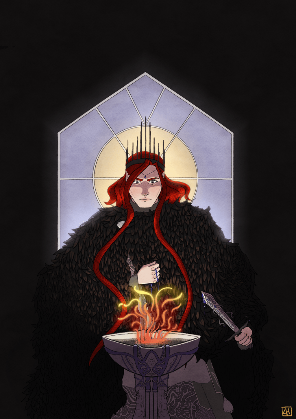
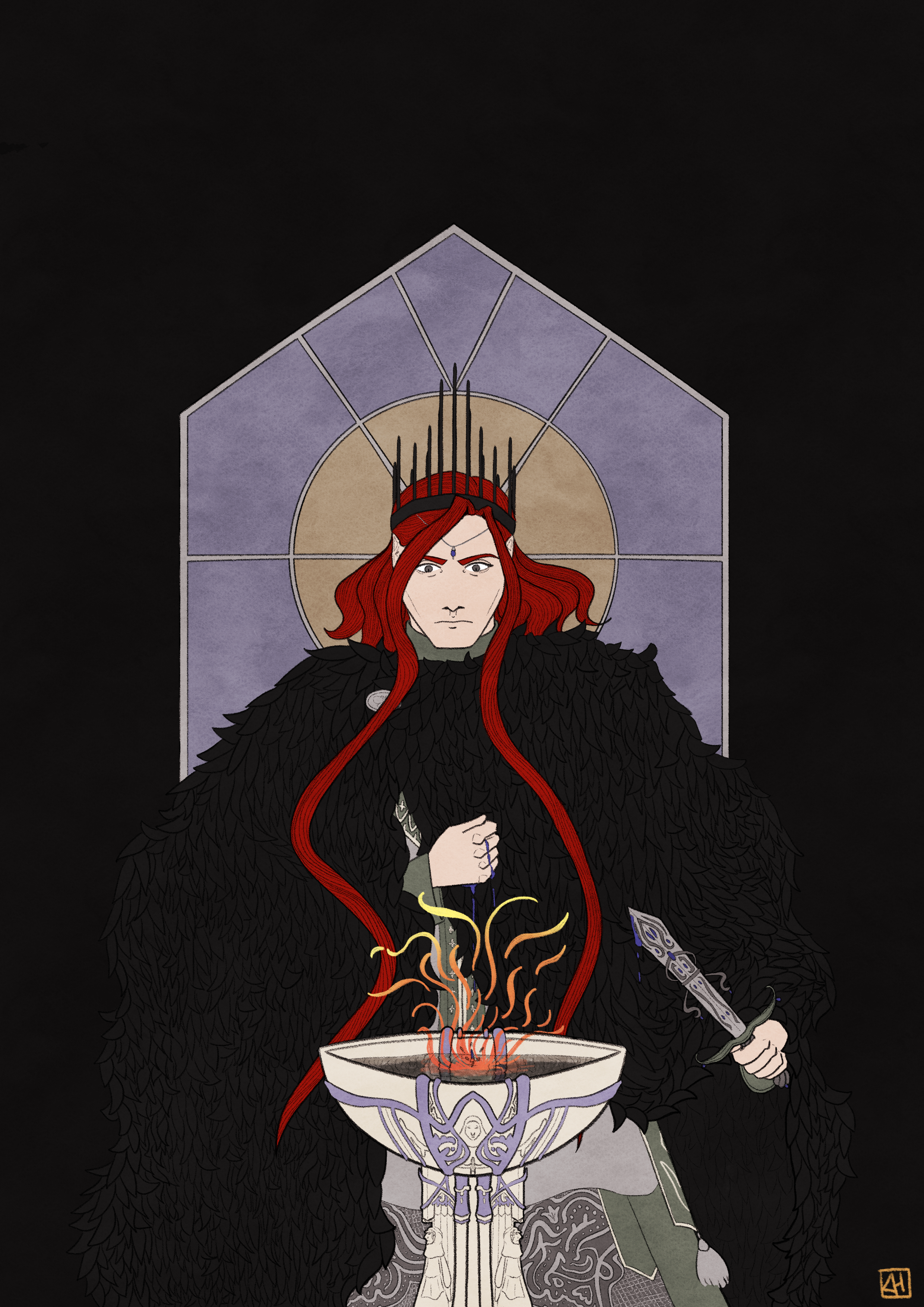
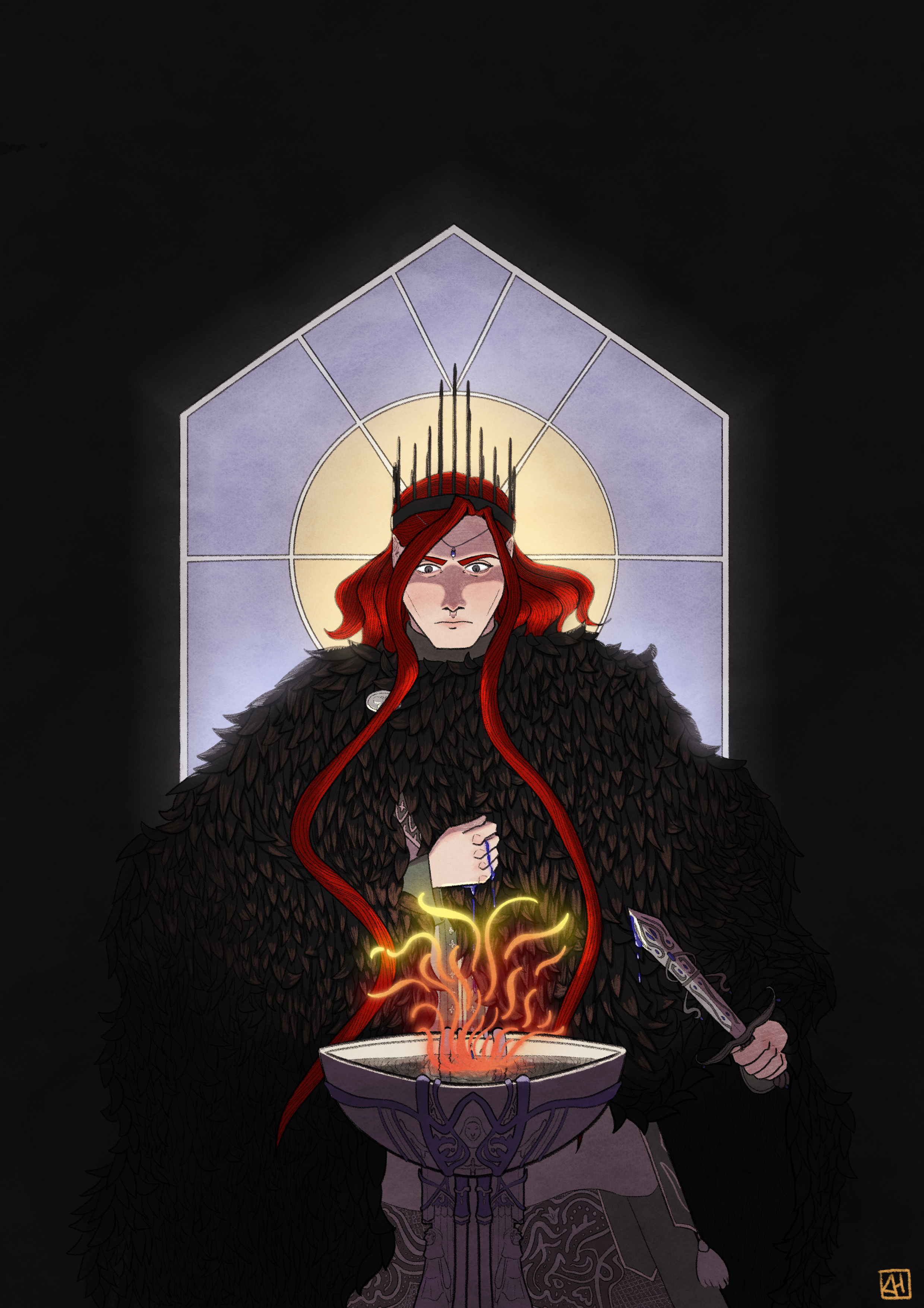
This piece is supposed to convey authority, seriousness and intrigue. A highly esteemed traveler is blessed by the changeling king and this piece illustrates this intense moment.
Inspiration
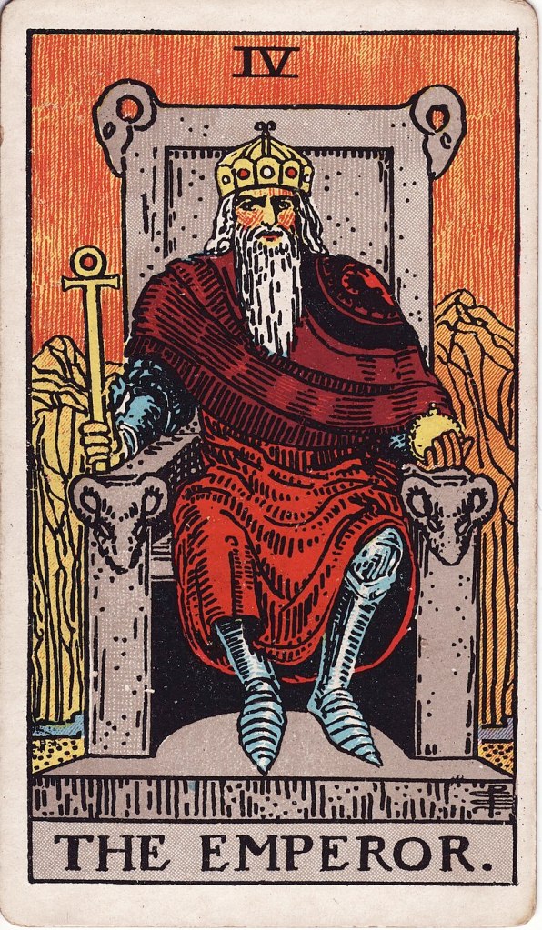
When I was considering different ways to convey authority apart from signaling social class (in this case through the character’s crown) I immediately thought of the tarot card “the emperor” for very apparent reasons. However, for this particular piece, I found it ill fitting for a few different reasons. People that do not believe in the occult might turn their nose on me using them as inspiration in my work, which I respect, but as a curious sceptic myself, please bear with me as I explain. Above everything else, I find these things incredibly fascinating from an archetypical and symbolic point of view as a way to spark inspiration. There is nothing esoteric about this in my mind, but some might beg to differ. I definitely do not do this for all my illustrations, but for this one in particular inspiration sparked in this direction.
The emperor’s archetype is quite straight forward to me. It is the kind of authority that upholds old structures. He sits on a throne made of stone, a material that is unmalleable and rigid. Additionally, he wears armor underneath his clothes, which makes me think he is prepared to fight to protect these old structures. This is not the type of authority I want to evoke with my illustration, for reasons that will become apparent very soon.
In folklore (at least of the Nordic variety, which I am most familiar with) changelings and fae are not associated with the very rigid power structures I associate with the emperor’s archetype. They are fickle and bound by rules that are foreign to us humans. The title of the illustration points toward an important detail; he is called “the changeling king”, not just “the king”. This means that his position as a “changeling king” either denotes that the king of this country usually is not a changeling or that this particular king has ruled his country in such an unusual way that he could not be of this world.

The reason why I am describing this in detail is to make my choice of archetype easier to understand. For this illustration I took inspiration from the tarot card called “The Magician”.
In tarocchi games the card is considered the lowest ranked card but is worth a lot of points. I immediately associate this description with ‘wild card’ or ‘gambit’, which already fits with the more fickle and unpredictable nature of changelings and the fae.
Additionally, the magician sympolises an authority of potential. The illustration on the card shows the symbolic representations of the four elements, which points towards the notion of unlimited potential. Potential is in and of itself neutral, but it denotes an instability and newness. It is also worth mentioning that the card is associated with the planet Mercury. Mercury is orbitally excentric with poles basked in eternal darkness and extreme temperatures, which only furthers the denotes the fickleness and multifacetedness of the magician’s authority.
Planning
Because of the feelings I wanted to convey with this piece I chose a relatively symmetrical composition.
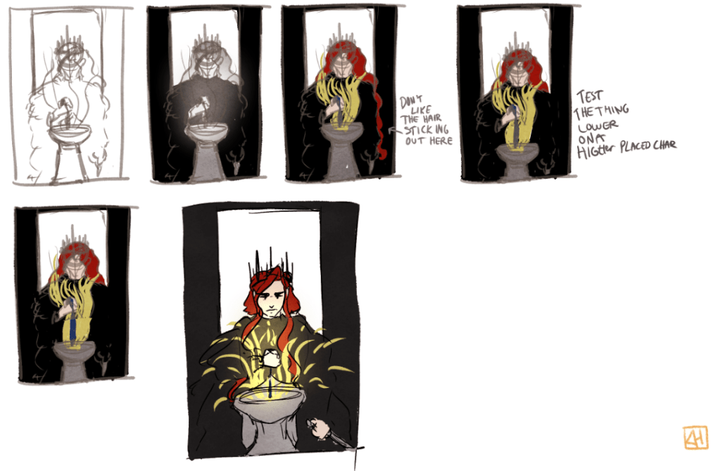
I planned for the background to have the symmetry that lined up with the character’s crown, which signal authority and seriousness, while the character himself and the magic he does is fiery and dynamic to show the intrigue and fickleness of his personality. While the thumbnails do not show it, I wanted to piece to incorporate the four elements like the magician card does.
The research time and concepting with thumbnails was about 40 minutes.
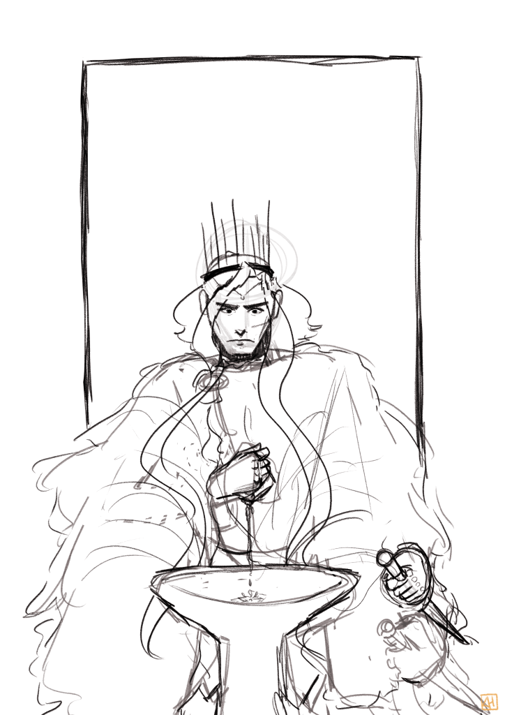
Sketching
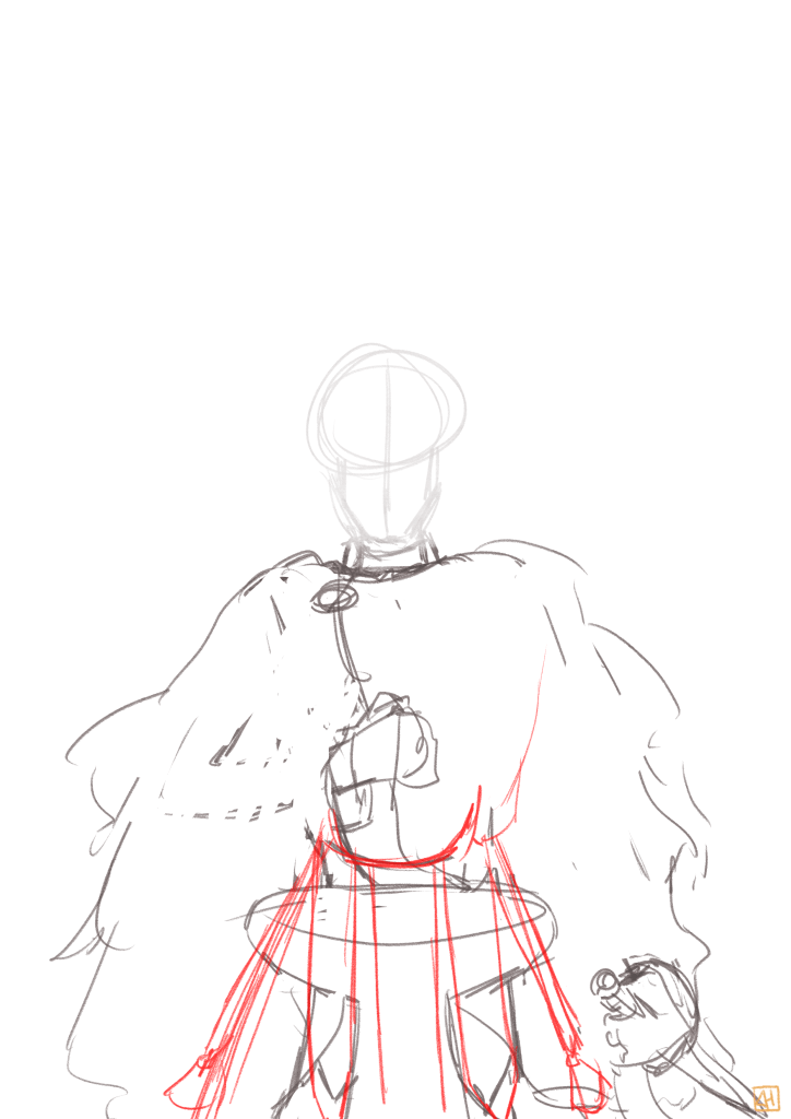
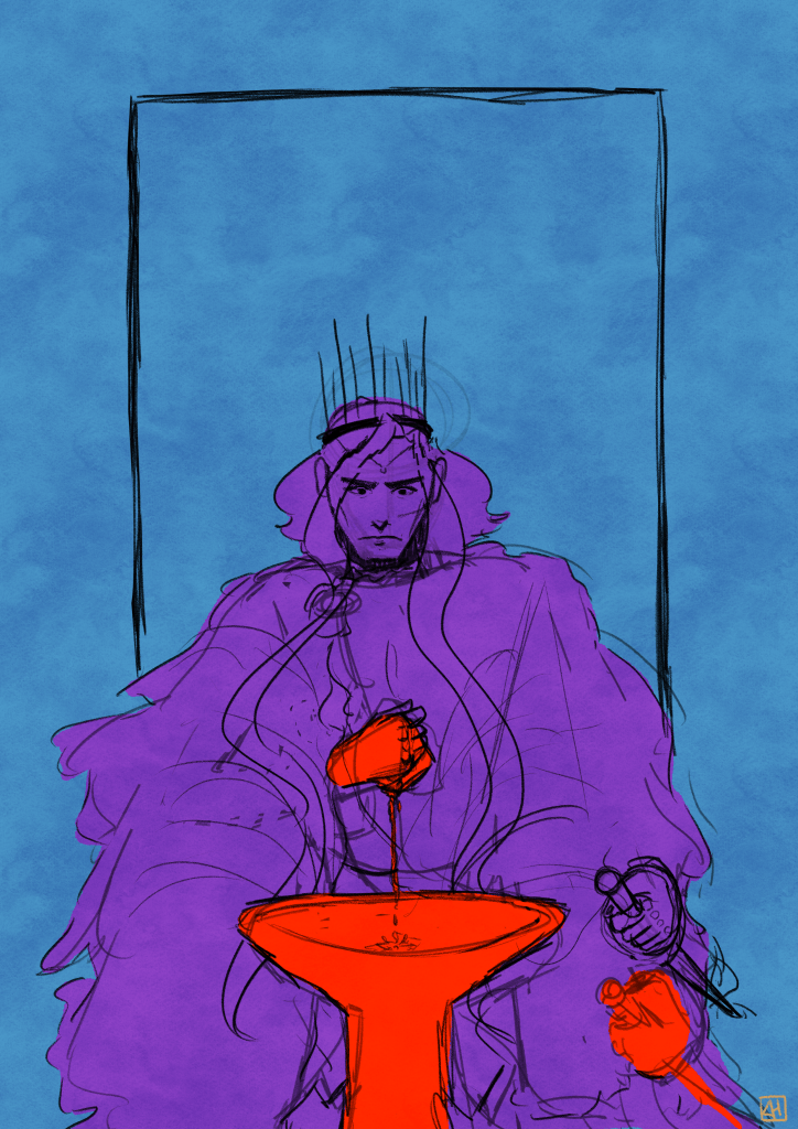
Learning from the mistakes of my previous illustration, I not only did a sketch, but I also mapped out the lighting and the separation between foreground, middle ground and background. Note that I moved the hand while cleaning up the sketches before moving on to line art, so it does not entirely line up with the separations of light and focal point. The sketching stage was an hour and 20 minutes.

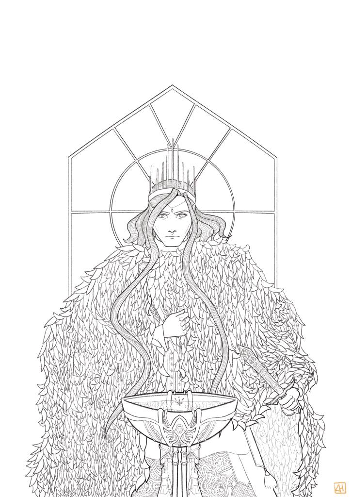
Line art
The line art was a lengthy process. There was immense detailing in the pelt, the goblet, the fabrics and the knife that I wanted to depict with clarity. I did my best to be mindful of the separations between the foreground, middleground and background like I had set out to do. As usual I worked with a pencil brush to pull out some texture and transparency in the minor details. I spent five hours and 20 minutes on the line art. I still want to make this a quicker process as I continue to improve my ability to withhold detail where it is not needed.
Color
With my deep dive into focal points and creating more well rounded illustrations, I have come around to enjoy coloring more. Previously I saw it as a arduous process, but I now enjoy the creative aspects of enhancing certain parts of my illustrations and pushing others into the back. This piece does not contain a plethora of color, which is in my eyes why it works successfully. The two colors I have focused the most on is red and yellow, similar to the magician card. The blues are there to contrast and balance them out. Laying the flat colors took two hours and the final rendering took four hours.
The final estimated time for this piece was 13 hours and 20 minutes. I allocated about 14 hours for it in its entirety, which is why I felt comfortable putting that much detail into the line art. See below for the comparison between the flat color and rendered final version!
Thanks for reading and until next time.

Leave a comment